

Root & Branch
Root & Branch is a green software consultancy that helps organisations build technology sustainably. They create custom digital products and low-carbon websites that reduce hardware use, energy consumption, and carbon emissions, benefiting the environment.
BRIEF
Create a brand strategy and identity for Root & Branch that reflects its mission and values. Additionally, develop a separate identity for the company’s flagship carbon-measurement product, Cardamon (Carbon Dashboard Monitor).
GOALS
Create a clean, simple, yet striking brand that stands out from other emerging companies in the industry, while maintaining a professional and appealing appearance.


SOLUTION | STRATEGY
The project began with a brand strategy workshop, where we explored the company’s purpose, vision, and values. We also analysed the market, competitors, and identified the ideal customer and value proposition. This foundation led to a custom brand identity that aligned seamlessly with the overall strategy.

SOLUTION | DESIGN
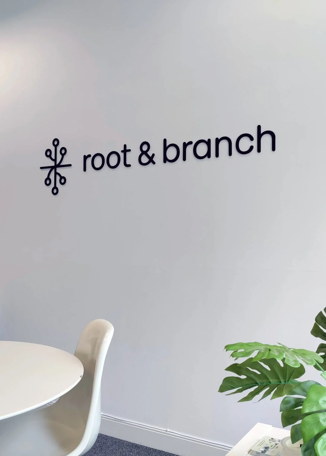
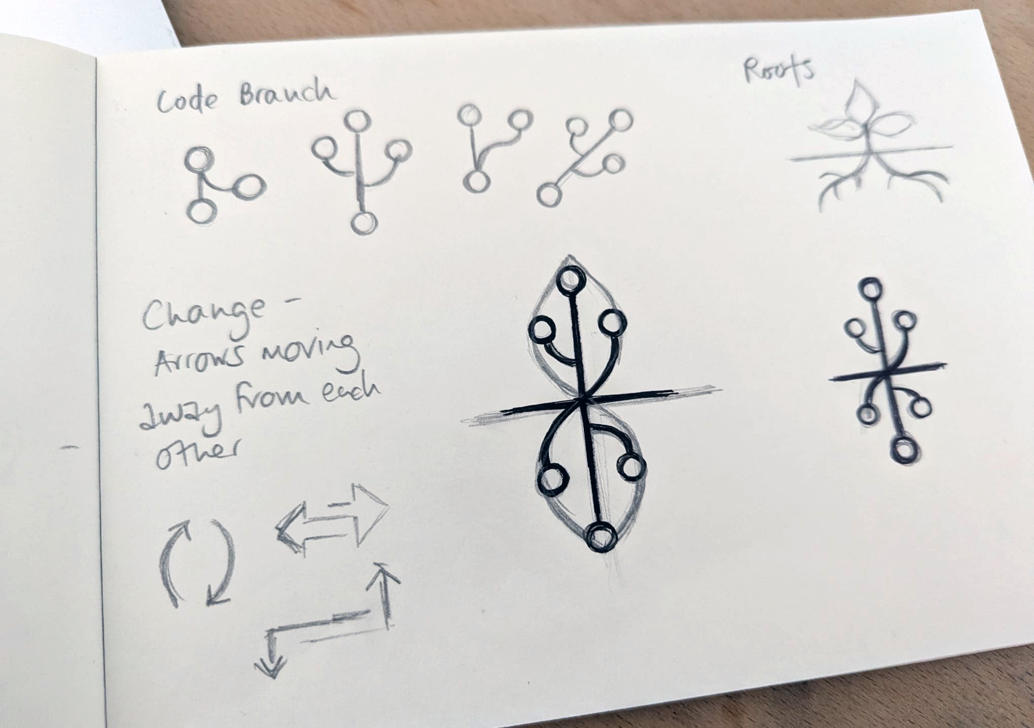
The logo combines two symbols: a code branch, representing software development, and roots, symbolising the environment and growth. The rounded lowercase font adds a friendly, trustworthy vibe. The colour scheme is clean, with black and white as primary colours, and orange (symbolising change) and green (representing the environment) as secondary, vibrant accents.
The Cardamon product design draws from the main logo to maintain a strong connection to the brand. Its icon, inspired by a Cardamom pod and seeds, is used creatively in marketing materials to add visual interest.


TESTIMONIAL
Emma has created an identity for our company that has evolved with us. It is hard to overestimate the value that brings. Emma has taken the time to truly understand what we are trying to achieve and represents that in every aspect of our brand and designs. I trust Emma to continue to capture and communicate what we are about with every twist and turn we take as a scaling company. I feel pride and confidence when I think about our brand and that speaks volumes in itself for Emma's work.
Oliver Winks, Co-Founder & Head of Technology, Root & Branch